TDA for beginners
This notebook walks through the core ideas of persistent homology and shows how to compute and compare persistence diagrams with Oineus. By the end you should know:
what a filtration is, with pictures;
where each point of a persistence diagram comes from;
how to tell signal from noise in a diagram;
how to compute diagrams from images and point clouds;
how to compare two diagrams with bottleneck and Wasserstein distances.
Everything runs on NumPy arrays — no extra dependencies beyond
matplotlib and oineus.
Setup
We use NumPy for arrays, Matplotlib for figures, and Oineus for persistence.
import numpy as np
import matplotlib.pyplot as plt

import oineus

rng = np.random.default_rng(42)
plt.rcParams.update({
    "figure.dpi": 110,
    "axes.grid": False,
    "image.interpolation": "nearest",
})
1. A filtration is a way to watch a shape grow
Persistent homology does not look at a single shape. It looks at a nested sequence of shapes — a filtration — and tracks features (connected components, loops, voids) as they appear and disappear.
A very useful filtration comes from sublevel sets of a function \(f\colon \mathbb{R}^2 \to \mathbb{R}\):
As we increase \(t\), \(S_t\) grows. New connected components can appear (birth in \(H_0\)), two components can merge (the younger one dies), and holes can form or fill in (births and deaths in \(H_1\)).
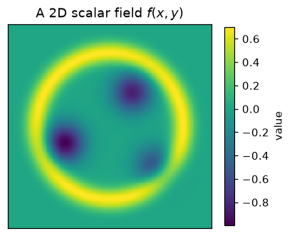
Let’s build a small test function and watch this happen.
# A 2D scalar field with three shallow valleys and a high ridge at
# radius ~1.3 around the origin. Its sublevel sets have a clean story:
# three blobs merge (H0), and there is a hole that eventually fills (H1).

n = 160
axis = np.linspace(-1.8, 1.8, n)
X, Y = np.meshgrid(axis, axis)


def field(X, Y):
    f = np.zeros_like(X)
    for cx, cy, depth in [(-0.8, -0.3, 1.0), (0.4, 0.6, 0.85), (0.8, -0.7, 0.6)]:
        f -= depth * np.exp(-((X - cx) ** 2 + (Y - cy) ** 2) / 0.12)
    r = np.sqrt(X ** 2 + Y ** 2)
    f += 0.7 * np.exp(-((r - 1.3) ** 2) / 0.04)
    return f


img = field(X, Y)

fig, ax = plt.subplots(figsize=(4.2, 4.2))
im = ax.imshow(img, extent=[-1.8, 1.8, -1.8, 1.8], origin="lower", cmap="viridis")
ax.set_title("A 2D scalar field $f(x, y)$")
ax.set_xticks([])
ax.set_yticks([])
plt.colorbar(im, ax=ax, shrink=0.78, label="value")
plt.show()
Sublevel sets
Below we plot \(S_t = \{f \leq t\}\) at six increasing thresholds. Watch how connected components appear and merge, and how a ring of untouched pixels forms around the origin before the high ridge is reached.
thresholds = np.quantile(img, [0.05, 0.14, 0.30, 0.55, 0.80, 0.97])

fig, axes = plt.subplots(2, 3, figsize=(9, 6))
for ax, t in zip(axes.flat, thresholds):
    mask = img <= t
    ax.imshow(
        mask,
        extent=[-1.8, 1.8, -1.8, 1.8],
        origin="lower",
        cmap="Greys",
        vmin=0, vmax=1,
    )
    ax.set_title(fr"$\{{f \leq {t:.2f}\}}$")
    ax.set_xticks([])
    ax.set_yticks([])
fig.suptitle("Sublevel sets $S_t$ at six increasing thresholds", y=1.02)
fig.tight_layout()
plt.show()
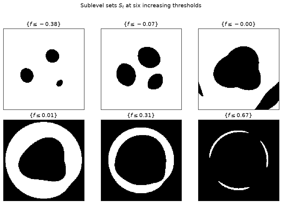
Reading this filmstrip: the first panel has three small black blobs — three independent \(H_0\) classes (connected components). As \(t\) grows the blobs merge; each merge is an \(H_0\) death at that threshold. Somewhere in the middle the black region forms a ring around a white hole — that is a new \(H_1\) class. Finally the ridge floods in and the hole fills — the \(H_1\) class dies.
Persistent homology records every one of these events. Each event contributes one (birth, death) point to the persistence diagram, in the appropriate homology dimension.
2. Your first persistence diagram
oineus.compute_diagrams_ls() does exactly what we just watched:
it builds a Freudenthal (triangulated-grid) filtration from img,
sweeps over it, and returns a oineus.Diagrams object with
one diagram per homology dimension.
dgms = oineus.compute_diagrams_ls(img, max_dim=1, include_inf_points=True)
h0 = dgms.in_dimension(0)
h1 = dgms.in_dimension(1)

print("H0:", h0.shape[0], "bars,  essential:", int(np.isinf(h0[:, 1]).sum()))
print("H1:", h1.shape[0], "bars,  essential:", int(np.isinf(h1[:, 1]).sum()))
H0: 19 bars,  essential: 1
H1: 70 bars,  essential: 0
Each row of h0 / h1 is a (birth, death) pair. An essential
class never dies within the filtration range — its death is +inf. For
a connected domain like ours there is always exactly one essential \(H_0\)
class (the whole space).
Let’s plot the diagram.
fig, ax = plt.subplots(figsize=(5.0, 5.0))
oineus.plot_diagram(dgms, ax=ax, title="Persistence diagram")
plt.show()
How to read this diagram
The diagonal is the line \(\text{death} = \text{birth}\). Every point lies above it, because features always die no earlier than they are born.
A point far from the diagonal is a persistent feature — it lived over a wide range of thresholds, so it is more likely to be “real” structure.
A point close to the diagonal lived only briefly — typically noise.
The infinite points at the top (triangle markers) are essential classes that never die.
In our example you should see:
several short \(H_0\) bars near the diagonal (merges between the three valley blobs that happened almost immediately), plus one essential \(H_0\) class;
one prominent \(H_1\) bar well above the diagonal — this is the hole inside the ring that you saw in the filmstrip.
3. Signal vs. noise under perturbation
The whole point of persistence is stability: small perturbations of the input only create short bars near the diagonal, while the long bars (real features) stay roughly in place. Let’s verify that.
noisy = img + 0.05 * rng.standard_normal(img.shape)
dgms_n = oineus.compute_diagrams_ls(noisy, max_dim=1, include_inf_points=True)

fig, axes = plt.subplots(1, 2, figsize=(9, 4.4))

axes[0].imshow(noisy, extent=[-1.8, 1.8, -1.8, 1.8], origin="lower", cmap="viridis")
axes[0].set_title("Noisy version of $f$")
axes[0].set_xticks([])
axes[0].set_yticks([])

oineus.plot_diagram(dgms_n, ax=axes[1], title="Persistence diagram (noisy)")
fig.tight_layout()
plt.show()
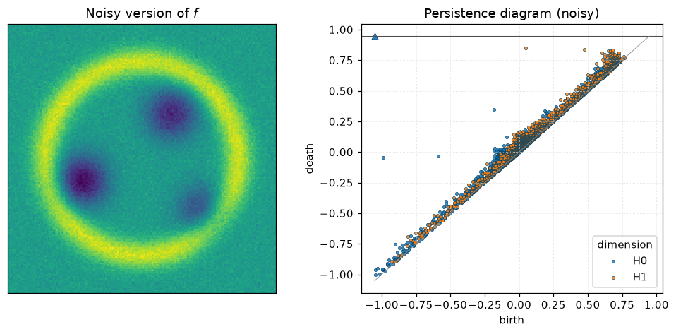
Noise produces a cloud of short bars near the diagonal. The long \(H_1\) bar that corresponds to the central hole is still there, in roughly the same position.
This is the simplest illustration of the stability theorem for persistence diagrams: the bottleneck distance between two diagrams is bounded by the supremum norm of the perturbation.
4. Point clouds: the Vietoris–Rips filtration
For a point cloud \(P \subset \mathbb{R}^d\), the filtration of choice is Vietoris–Rips. For each radius \(r\), form the simplicial complex whose simplices are subsets of \(P\) with pairwise distance \(\le r\). As \(r\) grows, new simplices are added — another filtration.
oineus.compute_diagrams_vr() builds this filtration and reduces
it. Let’s try it on a noisy circle: we expect one long \(H_1\) bar.
# A noisy circle
theta = rng.uniform(0, 2 * np.pi, 80)
pts_circle = np.column_stack([np.cos(theta), np.sin(theta)])
pts_circle += 0.05 * rng.standard_normal(pts_circle.shape)

# TODO: uncomment if Oineus is updated so that `max_dim` in
# compute_diagrams_vr means the max _diagram_ dimension (matching
# compute_diagrams_ls). Today it is the max _simplex_ dimension, so you
# must pass max_dim=2 to see any finite H1 deaths.
# dgms_c = oineus.compute_diagrams_vr(pts_circle, max_dim=1, max_diameter=2.5, include_inf_points=False)
dgms_c = oineus.compute_diagrams_vr(pts_circle, max_dim=2, max_diameter=2.5, include_inf_points=False)

fig, axes = plt.subplots(1, 2, figsize=(9, 4.4))
axes[0].scatter(pts_circle[:, 0], pts_circle[:, 1], s=16)
axes[0].set_aspect("equal")
axes[0].set_title("80 noisy points on a circle")

oineus.plot_diagram(dgms_c, ax=axes[1], title="VR diagram of the circle")
fig.tight_layout()
plt.show()
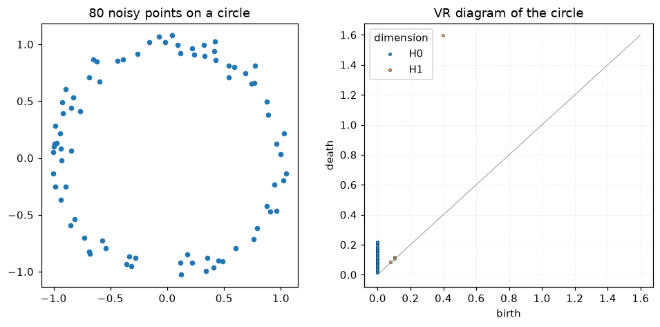
You should see one prominent \(H_1\) point well above the diagonal — that is the circle’s one-dimensional hole. Its birth happens when every pair of adjacent points has been connected by an edge; its death happens when the loop is finally filled in by a 2-simplex, typically at roughly the diameter of the circle.
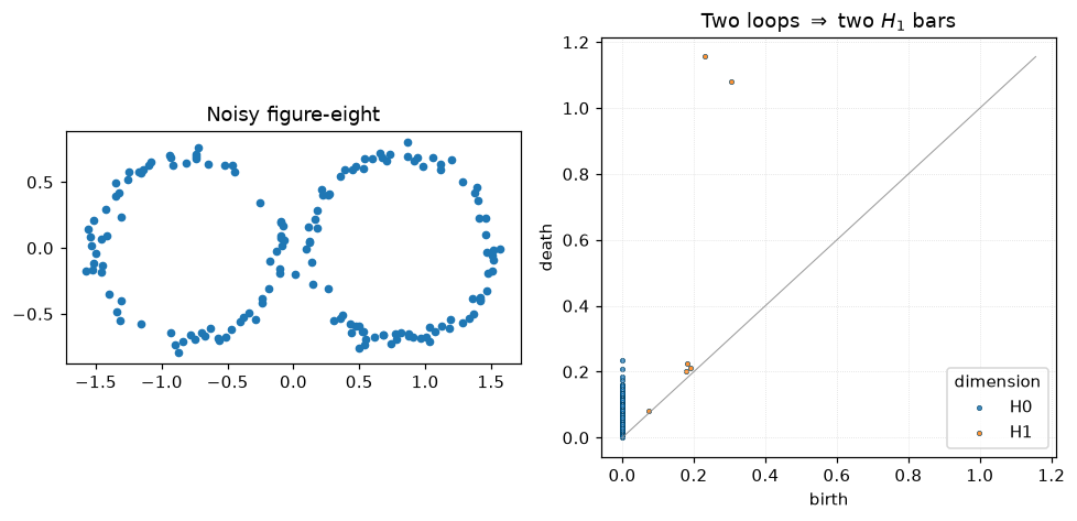
Try a figure-eight and you should see two prominent \(H_1\) bars:
t = rng.uniform(0, 2 * np.pi, 160)
side = rng.integers(0, 2, 160)
cx = np.where(side == 0, -0.8, 0.8)
pts_8 = np.column_stack([cx + 0.7 * np.cos(t), 0.7 * np.sin(t)])
pts_8 += 0.04 * rng.standard_normal(pts_8.shape)

# TODO: uncomment if Oineus is updated so that `max_dim` means the max
# diagram dimension in compute_diagrams_vr (see earlier cell).
# dgms_8 = oineus.compute_diagrams_vr(pts_8, max_dim=1, max_diameter=2.5, include_inf_points=False)
dgms_8 = oineus.compute_diagrams_vr(pts_8, max_dim=2, max_diameter=2.5, include_inf_points=False)

fig, axes = plt.subplots(1, 2, figsize=(9, 4.4))
axes[0].scatter(pts_8[:, 0], pts_8[:, 1], s=16)
axes[0].set_aspect("equal")
axes[0].set_title("Noisy figure-eight")
oineus.plot_diagram(dgms_8, ax=axes[1],
                                title="Two loops $\\Rightarrow$ two $H_1$ bars")
fig.tight_layout()
plt.show()
5. Comparing two diagrams
Once you have diagrams, the next question is usually: how similar are two datasets, topologically? Two distances dominate the literature:
Bottleneck distance: the smallest \(\delta\) such that we can match points of the two diagrams (allowing unmatched points to go to the diagonal) with every pair within \(L^\infty\)-distance \(\le \delta\).
\(q\)-Wasserstein distance: the total matching cost, using \(L^p\)-distance per pair and summing \(p\)-th powers.
Both are stable under perturbations of the underlying data.
# Two slightly different noisy circles
theta_ref = np.linspace(0, 2 * np.pi, 80, endpoint=False)
p_a = np.column_stack([np.cos(theta_ref), np.sin(theta_ref)]) \
      + 0.03 * rng.standard_normal((80, 2))
p_b = np.column_stack([np.cos(theta_ref), np.sin(theta_ref)]) \
      + 0.08 * rng.standard_normal((80, 2))

# TODO: uncomment if Oineus is updated so that `max_dim` means the max
# diagram dimension (see earlier cell).
# d_a = oineus.compute_diagrams_vr(p_a, max_dim=1, max_diameter=2.5, include_inf_points=False).in_dimension(1)
# d_b = oineus.compute_diagrams_vr(p_b, max_dim=1, max_diameter=2.5, include_inf_points=False).in_dimension(1)
d_a = oineus.compute_diagrams_vr(p_a, max_dim=2, max_diameter=2.5, include_inf_points=False).in_dimension(1)
d_b = oineus.compute_diagrams_vr(p_b, max_dim=2, max_diameter=2.5, include_inf_points=False).in_dimension(1)

bd = oineus.bottleneck_distance(d_a, d_b)
wd = oineus.wasserstein_distance(d_a, d_b, q=2.0)
print(f"bottleneck      = {bd:.4f}")
print(f"Wasserstein q=2 = {wd:.4f}")
bottleneck      = 0.1159
Wasserstein q=2 = 0.1185
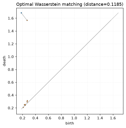
Visualising the matching
oineus.wasserstein_matching() returns an explicit optimal
matching between points of the two diagrams. Points that have no
partner get paired with their projection onto the diagonal.
match = oineus.wasserstein_matching(d_a, d_b, q=2.0)
print(f"finite -> finite pairs: {len(match.finite_to_finite)}")
print(f"A points projected to diagonal: {len(match.a_to_diagonal)}")
print(f"B points projected to diagonal: {len(match.b_to_diagonal)}")
print(f"Wasserstein distance: {match.distance:.4f}")

fig, ax = plt.subplots(figsize=(5.2, 5.2))
oineus.plot_diagram(d_a, ax=ax, color="tab:blue",
                                title=f"Optimal Wasserstein matching (distance={match.distance:.4f})")
oineus.plot_diagram(d_b, ax=ax, color="tab:orange")

# Overlay the matching: solid lines between matched finite points,
# dotted lines for points projected to the diagonal.
for i, j in match.finite_to_finite:
    ax.plot([d_a[i, 0], d_b[j, 0]], [d_a[i, 1], d_b[j, 1]],
            color="gray", alpha=0.7, linewidth=0.9)
for i in match.a_to_diagonal:
    mid = 0.5 * (d_a[i, 0] + d_a[i, 1])
    ax.plot([d_a[i, 0], mid], [d_a[i, 1], mid],
            color="tab:blue", alpha=0.45, linestyle=":", linewidth=0.8)
for j in match.b_to_diagonal:
    mid = 0.5 * (d_b[j, 0] + d_b[j, 1])
    ax.plot([d_b[j, 0], mid], [d_b[j, 1], mid],
            color="tab:orange", alpha=0.45, linestyle=":", linewidth=0.8)
plt.show()
finite -> finite pairs: 1
A points projected to diagonal: 0
B points projected to diagonal: 6
Wasserstein distance: 0.1185
6. Recap and where to go next
You now know how to:
build a filtration from an image (
compute_diagrams_ls) or a point cloud (compute_diagrams_vr);read a persistence diagram, and distinguish signal from noise;
compare two diagrams with
bottleneck_distanceandwasserstein_distance, and inspect the optimal matching withwasserstein_matching.
Natural next steps:
The quickstart and tour pages summarise the complete Python API.
The topic essays explain individual features (Fréchet means, KICR, differentiable diagrams, optimization) in depth.
The TDA for experts notebook — once written — covers parallel reduction, matrix access, kernel persistence, critical-set optimization, and PyTorch autograd.